Do it yourself book covers – Part 4 – Ebooks and paperbacks

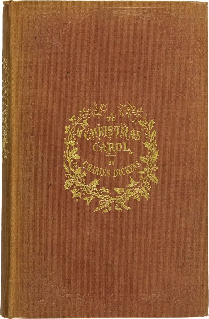
Once upon a time, books were precious objects and meant only for people who could afford them. They were mostly leatherbound and often with tooled gold leaf such as this first edition of Dicken’s classic Christmas novel. Books like these were put on display and were as much a status object as having fine paintings or furniture. Even more, perhaps, as it implied that their owners were of a sensitive and literate disposition.

Although a sort of dust jacket was in use as early as the 1820’s, it was a century later that they became ubiquitous. Publishers also found it cheaper to produce ornate dust jackets than ornate tooling and binding and so the book cover was born. Now, books became a display item in shops and visual information about the book was immediately available to a purchaser.

Paperbacks were being produced in the 1840’s in Germany so they are hardly a new idea. However, they took off in the 1940’s with Allan Lane’s Penguin books. These tended to be mostly reprints of existing titles but in the 1950’s the paperback revolution really kicked off with original titles being published en masse for the first time. These were books that just about everyone could afford and original genre fiction such as romance, science fiction, westerns and, of course, crime became wildly popular.

Continue reading

Do it yourself book covers – Part 3 – Using images

herat is a lonely hunter cover

While there are some book covers that don’t use images like the one on the left, I’d guess that these are in the minority. However, in this case, the stylised 3D font used in the title is a sort of image anyway. So, the first question you might want to ask is, does my book cover actually need an image? If the answer is yes then read on.

If you search in Amazon books for a particular genre and scroll down the covers then you will see that the huge majority of book covers use an image. If the search is for crime novels then you will also see that many of the covers are quite similar; dark colours with a solitary figure usually in silhouette. Of course, the plus point of this is that this is useful visual shorthand for telling the reader what genre they’re looking at. While I’ve read that putting a human figure on a cover sells books, I’ve never actually found any hard evidence to support this. There’s a lot of information out there about what makes the best cover and a lot of it is quite contradictory. So what’s the best course to take?

I’ve honestly got no idea. Anything I say in these posts is just my take but, for me, my covers are an integral part of the book. While I obviously want people to read my books, none of them have been written with commercial considerations in mind. I’ve just tried to write the stories that come to me as best I can. I feel the same about my covers. I don’t want a gloomy cover with a solitary figure unless that’s what I feel the story needs. If you look at my covers, you can see that they’re all quite different but, hopefully, they all reflect something of the story inside. I’ll use three examples to illustrate this.

Continue reading

Do it yourself book covers – Part Two – How to compile your cover

You might wonder at the word ‘compile’ being used in this context. After all, it means ‘ to collect information in order to produce a list or a book‘ or, indeed, a crossword. However, I think that it’s quite appropriate as every book cover can be viewed as something of a puzzle.

Firstly, I’d like to demystify the art of producing book covers a little. Many writers think that this involves some dark technical arts and skill sets that they could never achieve. They are wrong on both counts. When I worked at the BBC, I was for the most part embedded in web design teams. These teams would be self-contained and have all the skills required to produce a state of the art website, in this case BBC Sounds. The team was comprised of coders and designers but also others who looked at the structure of the website and who were responsible for turning audience data into better websites.

The designers I worked with fascinated me. For all the high tech available, they most often selected the simplest techniques to get where they wanted to go. Pencil sketches and sticky notes for the most part and only towards the end, when the designs needed to be formalised, did they start using software. Even then, it would sometimes be relatively simple software. I learned that not all designers are experts at Photo Shop and the like.

Continue reading

Do it yourself book covers – Part One – Introduction

When I published my first book, I was lucky in that I knew someone who was a talented graphic designer. I gave him a brief and he came back to me with some wonderful images. This worked fine until the designer was no longer available and I was faced with a dilemma. Get a new designer or do it myself. I opted for the latter.

You might think that this was a bit presumptuous of me, after all I’m a writer not a designer. However, I had worked at the BBC for nearly fifteen years with some of the best designers around and a fair bit of it was bound to rub off on me. So, every cover since book nine – The Tiger’s Back – has been done by me. It’s not up to me to judge my own work but I get my readers, who sanity check my books before publication, to also comment on the covers. So far, so good.

But it’s a lot of work and what do I really get out of it?

Continue reading

The trouble with book covers…

The eagle eyed amongst you will have noticed that the cover of The Body in the Boot has recently changed, not once but twice. This is why.

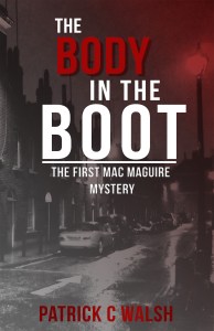
This is the original cover and it was one I quite liked. It’s the first book in the series and therefore I’m anxious to advertise it as much as possible on the grounds that if a reader likes it then they might read the other eight.

I told the designer that I wanted something that suggested film noir, those lovely old crime movies from the forties and fifties and I think he did a good job. So what’s the problem then? Well, Amazon have now made it easier for me to get my books featured on the Kindle lockscreen and it’s an advertising opportunity that I felt I couldn’t miss out on. Unfortunately Amazon also have a myriad of rules around what qualifies for a lockscreen ad and 3D lettering in the title is something that they don’t like for some reason. I have the original file but it’s a Photoshop file and, as I’m not proficient on Photoshop, I decided to try making another cover. Continue reading