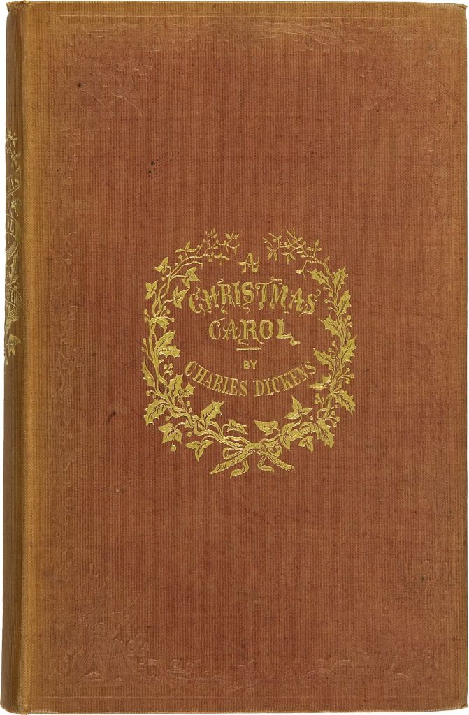
Once upon a time, books were precious objects and meant only for people who could afford them. They were mostly leatherbound and often with tooled gold leaf such as this first edition of Dicken’s classic Christmas novel. Books like these were put on display and were as much a status object as having fine paintings or furniture. Even more, perhaps, as it implied that their owners were of a sensitive and literate disposition.
Although a sort of dust jacket was in use as early as the 1820’s, it was a century later that they became ubiquitous. Publishers also found it cheaper to produce ornate dust jackets than ornate tooling and binding and so the book cover was born. Now, books became a display item in shops and visual information about the book was immediately available to a purchaser.
Paperbacks were being produced in the 1840’s in Germany so they are hardly a new idea. However, they took off in the 1940’s with Allan Lane’s Penguin books. These tended to be mostly reprints of existing titles but in the 1950’s the paperback revolution really kicked off with original titles being published en masse for the first time. These were books that just about everyone could afford and original genre fiction such as romance, science fiction, westerns and, of course, crime became wildly popular.
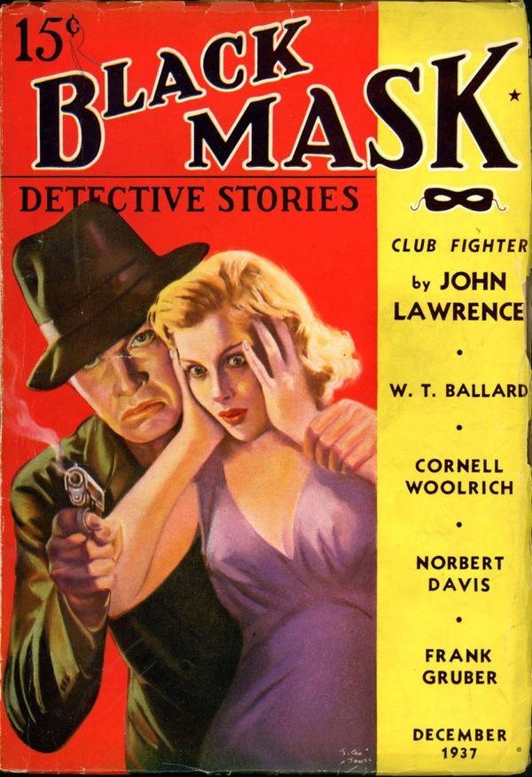
For crime books it wasn’t the art of the literate dust jackets that influenced paperback covers as much as the lurid magazines that had been around for a while. Black Mask was one of the most popular and included stories by authors such as Erle Stanley Gardner, Dashiell Hammett and Raymond Chandler. The covers were luridly bright and usually featured a femme fatale in some sort of trouble.
I guess the thinking was that, if these covers sold magazines, then they would sell books too. Please note that such covers, many featuring violence, would never get past Amazon’s rules on images today.
The paperback cover was intended for a physical object of a certain size and shape. However, it has now become a paradigm for ebook covers too. If you think about it, why should an ebook have a ‘cover’ at all? I guess that the answer is that it encodes information about a book in a way that is universally understood. There are lots of instances of archaic forms of objects continuing to exist. The classic one is the ‘Save’ icon in use on most computers. The symbol is that of a floppy disk. These discs, used to record programs, were phased out in the late 1990’s yet the symbol lives on. It’s just something that we all understand.
Ebooks

So, a successful ebook cover has to respect the norm and closely resemble a physical book. It has to be rectangular with a prominent title, the author’s name and strap line or series information if applicable. It also usually has an image or images that visually informs the reader of what they are likely to get. If you look at the cover on the left you might guess that the story involves a poisoning. Before you design your first cover, put your book genre in Amazon as a search term and take a few hours to scroll down the infinite list of books. There are three reasons for doing this. The first is to get you to understand just how many books exist in your genre that people can buy. Why should they buy yours? Next, try and spot the similarities between covers. If you want yours to stand out then shouldn’t it be a bit different? Thirdly, amongst the professionally produced covers, try to spot the amateur ones. This isn’t hard as most of these are done using the images within Kindle Cover Creator and they really suck. Make sure that yours doesn’t resemble one of these.
You will need to test your ebook cover by reducing it to a thumbnail (around 15% on Excel) and seeing what it looks like. Can you still read the title? Is the main image still visible? The reason that you need to do this is because Amazon will use a smaller image of your cover for search results, ads etc. so it’s best to make sure that it will work at such a size.
A few tips –
- If your background colour is fairly light then ensure that you have a dark line around the border of your rectangle. Otherwise, your cover will melt into the light background of the page
- Don’t put your name first and in larger font than the title. You get to do that once you become an international best seller otherwise it smacks of egoism
- If you can, ensure that your background is a standard colour. You will see why below.
Paperbacks
These can be a minefield as you have a front cover, a back cover and a spine to deal with. However, there is an easier way that will still give you a decent cover. Using Kindle’s Cover Creator, import you ebook cover image and position it just inside the boundary on the front page. If you can select a background colour that is identical to the background on the ebook cover then it will appear seamless. You can then enter the text on the spine and the blurb at the back and you’re there. Note that you will have to make your ebook cover a little brighter as it will always appear darker when you get the physical book. Always order a proof copy first and ensure that it all looks as it should. Remember that, unless you order author copies and sell them, readers will have already paid for the book before they see it.
And that’s it really. Whatever happens there will be a lot of trial and error involved but, if you can make it work, you will have a lot more control over your publishing timelines. So, if you can’t afford a cover designer, give it a try. You might just come up with something that you can live with.
Best of luck.
