
While there are some book covers that don’t use images like the one on the left, I’d guess that these are in the minority. However, in this case, the stylised 3D font used in the title is a sort of image anyway. So, the first question you might want to ask is, does my book cover actually need an image? If the answer is yes then read on.
If you search in Amazon books for a particular genre and scroll down the covers then you will see that the huge majority of book covers use an image. If the search is for crime novels then you will also see that many of the covers are quite similar; dark colours with a solitary figure usually in silhouette. Of course, the plus point of this is that this is useful visual shorthand for telling the reader what genre they’re looking at. While I’ve read that putting a human figure on a cover sells books, I’ve never actually found any hard evidence to support this. There’s a lot of information out there about what makes the best cover and a lot of it is quite contradictory. So what’s the best course to take?
I’ve honestly got no idea. Anything I say in these posts is just my take but, for me, my covers are an integral part of the book. While I obviously want people to read my books, none of them have been written with commercial considerations in mind. I’ve just tried to write the stories that come to me as best I can. I feel the same about my covers. I don’t want a gloomy cover with a solitary figure unless that’s what I feel the story needs. If you look at my covers, you can see that they’re all quite different but, hopefully, they all reflect something of the story inside. I’ll use three examples to illustrate this.
I got the title for Two Dogs from a quote by George Bernard Shaw and I use it in the book –
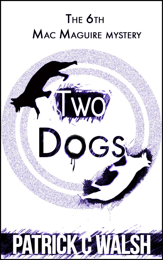
“A Native American elder once described his own inner struggles in this manner: Inside of me there are two dogs. One of the dogs is mean and evil. The other dog is good. The mean dog fights the good dog all the time. When asked which dog wins, he reflected for a moment and replied, The one I feed the most.”
This title was quite apposite as it illustrates the struggle between good and evil that we all face and there were actually two dogs in the story that were integral to the plot. This cover was done by a graphic designer. I explained the plot but I think it was the quote itself that was the real inspiration as the designer looked at Native American art and even cave paintings. It very graphically contrasts the two dogs as being black and white and this is also reflected in the font colours used in the title.
I’d guess that this is probably my favourite cover and it shows what you can get if you can find a good designer who actually listens to you. However, good designers rarely come cheap and most may be well beyond a lot of authors’ budgets. If you’re not an author with money to burn then DIY covers might be for you.
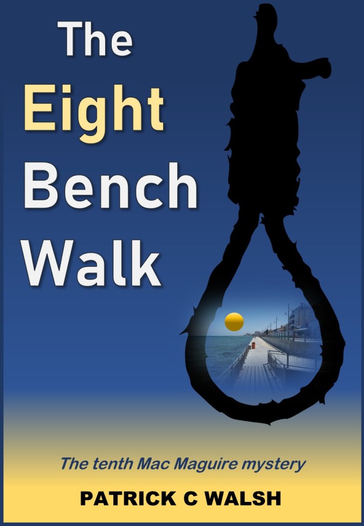
The Eight Bench Walk was my second DIY cover and one that I quite like. The background is simply a filled rectangle using three colours – a light yellow, blue and a slightly darker blue. This is quite easily done in Excel using Shape format/Shape fill/Gradient. I hoped that this might make the reader think of beaches, blue seas and blue skies. Holidays, in other words. This is reflected in the composite image inside the noose showing a seaside esplanade and a setting sun.
In this book, Mac Maguire has gone on holiday to Cyprus and, of course, there is a suspicious death. An old Englishman is apparently pushed to his death from a balcony and the ensuing investigation leads Mac into some surprising places. In selecting something that might encapsulate the story, I chose the hangman’s noose. In the book, a historic hanging proves to be the real reason for the old man’s death. I got the idea for this while on holiday in Larnaka when I visited the old fort. Inside, one of the rooms had a wooden barrier behind which there was a drop. This is where people were hanged under British rule. I think that the contrast between the happy holiday colours and the black menacing noose works quite well.
The hardest bit of the cover was probably the little composite image inside the noose but I think it would have worked quite well without it. So, simply using the right colours and a single stark image might be all you need.

A Concrete Case of Murder was probably the simplest book cover of all, although it still took quite a while to put together. It took so long because I couldn’t believe that it could be so simple. I came across the image of cracked concrete quite early on and saved it, however, I kept looking at other images for days. I kept coming back to this one which should have told me something. Eventually, I gave in and designed the cover using the image. Somewhat to my surprise, my readers really liked it and felt that it reflected the theme of the book.
Early on in the story, a body is indeed slipped into a pool of concrete but the crack represents the divisions in a family who own an international construction business. Safe to say, it does not end well.
I’ve found that I like making certain words stand out in my titles by using a different font colour. For The Eight Bench Walk, the colour on the word ‘Eight’ is quite subtle but here I’ve highlighted the word ‘Murder’ by making it red. The eye quite easily picks up contrasts and I’m hoping here that the highlighted word stands out so that readers are assured that this is indeed a crime story.
Some major caveats about using images
One of the reasons I’ve heard authors cite when it comes to not doing your own book covers is the inherent danger in using images. If you use a copyrighted image without permission you might be sued, unlikely perhaps, but what’s not unlikely is that Amazon will take the offending book off its site. If you want to use an image then make sure that you check the licence first.
Of course, one option is to create the image yourself. Any photo taken in a publicly accessible space may be used but I don’t advise using photos of people who haven’t agreed for their image to be used. It’s not illegal but it’s not polite either. Photos taken inside buildings such as museums, galleries etc may be subject to restrictions, so please check.
However, there are sites that will give you royalty-free images that you can use, often without attribution. My favourite is Pixabay. It has lots of images available for free and, most importantly, lots of vector graphics that you can use to make your own composite image. If you find something you really like, you can make a small donation to the creator. I also use Openverse which used to be called Creative Commons Images. Use the filters on the right to only get images you can use commercially and adapt. You will need to credit the image creator but this is only being polite. Whatever you do always check the licencing agreement. This might save you a lot of pain further down the line.
In the forth and final part of this series, I’ll be looking at the differences between Ebook and paperback covers
